Website Redesign for Literary Agency
Literary agency of innovators shaping the future of Ukrainian publishing.
However, their potential was lost due to an outdated and unstructured website.
My Role
I was responsible for the design of the e-commerce part of the platform, defined the visual style, analyzed competitors, and worked on the user flow.
Design Process
We started with research and client interviews to identify key UX issues. Based on insights, we defined solutions and mapped them out in wireframes. Then we developed the visual identity, refined the UI, and delivered the final mockups. The project wrapped with a clickable prototype and a client presentation.
1. Research & Insights
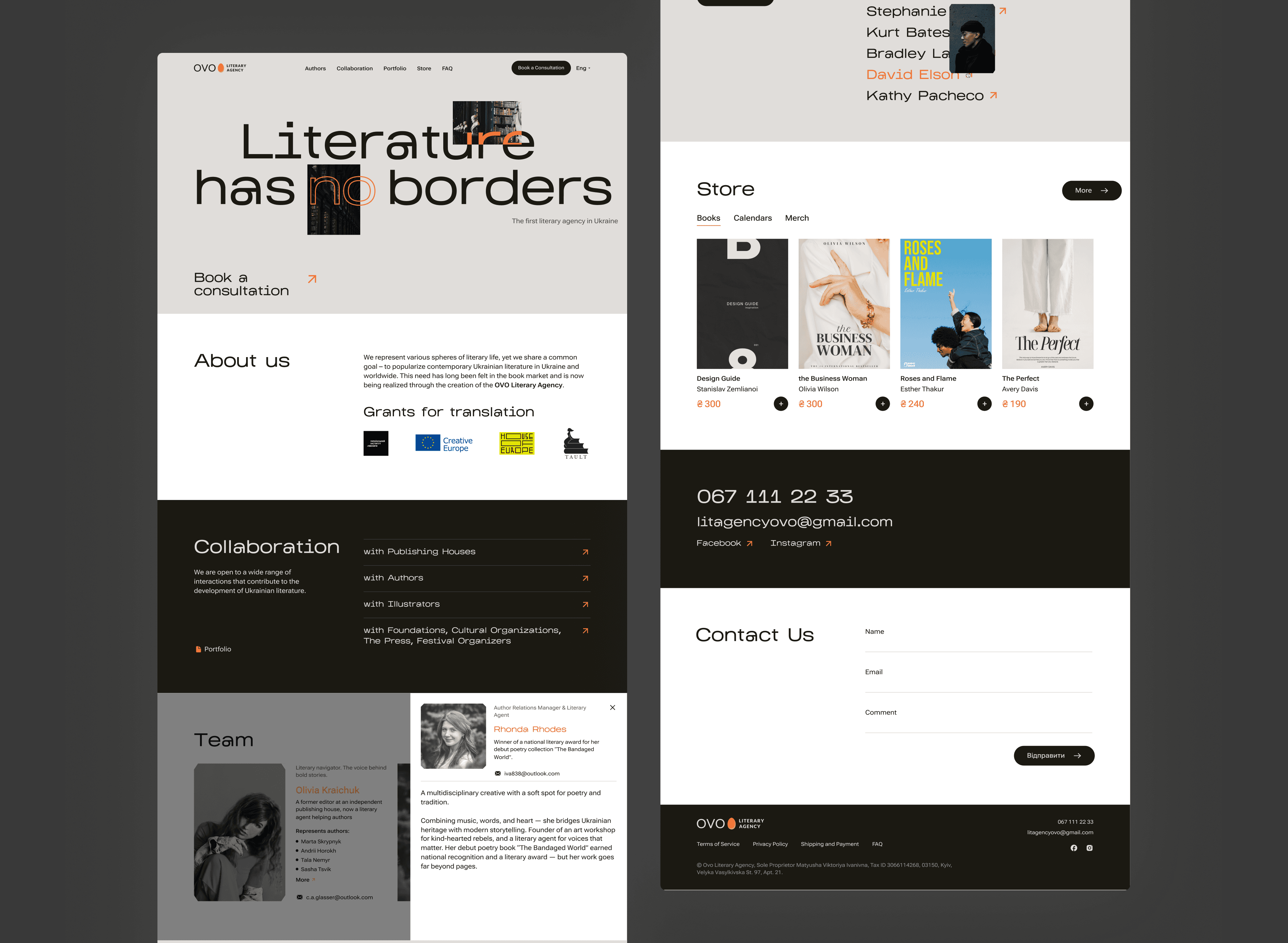
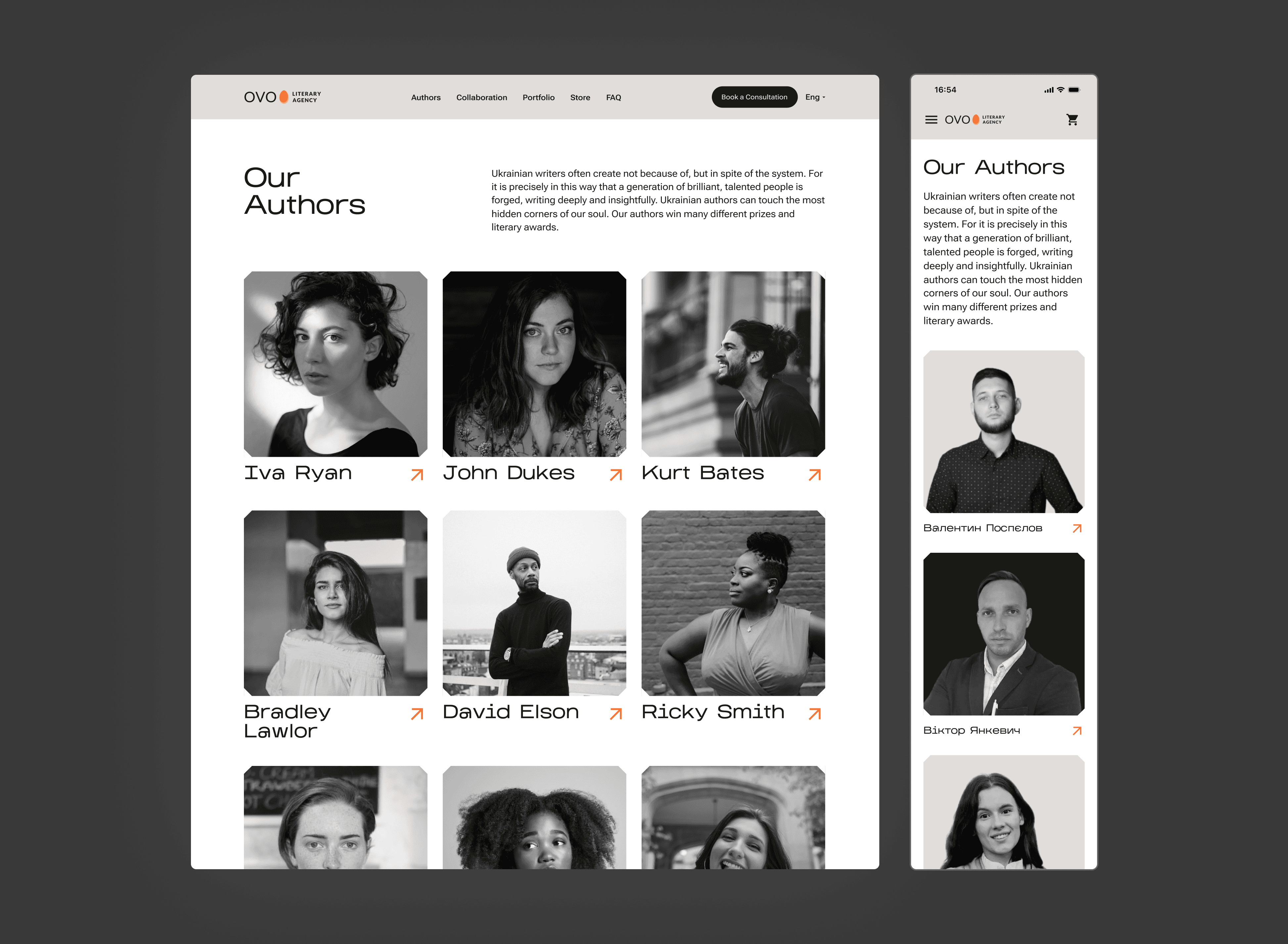
We started by talking directly with the client to understand their goals, audience, and pain points. The existing site was hard to navigate, with scattered content and unclear service flows. We also ran a quick competitor analysis, which helped us identify best practices in structure, calls to action, and content hierarchy. These insights laid the foundation for simplifying the user journey and highlighting key value areas like the shop and portfolio.
2. Ideation & UX Solutions
Based on our insights, we brainstormed and mapped key UX improvements. We simplified the user flow, introduced multiple entry points to high-value sections, and reimagined the service ordering experience to feel less transactional and more personalized.
3. Visual Identity & UI
We built a clean, modern interface that reflects the agency’s bold yet thoughtful identity. The original brand color was kept as a core accent, paired with a calm, minimalist palette to balance emotion and clarity. We focused on clear visual hierarchy, accessible typography, and enough white space to let content breathe — making the design feel elegant without losing functionality.
4. Presentation
We wrapped the project with a clickable prototype and a final presentation for the client. The goal was to clearly communicate our design decisions, show the improved user flow in action, and highlight how the new interface supports both business and user needs.
Feedback
“We are very grateful for the work. As for the results:
1) Communication and collaboration with clients has become significantly easier.
2) We’ve received positive feedback about the website design.”
— Viktoriia Ma, Executive Director, Founder of "OVO Literary Agency"