How we helped 7k+ applicants
Platform that helps Ukrainian applicants navigate university admissions with confidence and clarity
STUDINFO is an EdTech platform that simplifies the university application process in Ukraine by providing applicants with personalized recommendations, up-to-date data, and tools to make informed decisions about their educational path.
In a landscape where applicants face information overload and unclear admission rules, STUDINFO serves as a free digital assistant that helps them navigate the application process with confidence.
My Role
• Designed: Saved profiles, Personalized profile page, Competitive offer page, Profile settings page, Study materials for NMT preparation
• Research: Interviews, Surveys, User personas, CJM, JTBD, Prioritization, Pricing
• Usability testing
• Social media materials
Design Process
We followed a User-Centered Design methodology. Here’s how the process looked:
1. Specify Context of Use
We identified three primary user groups for STUDINFO:
• High school graduates
• College graduates
• Parents supporting their children in choosing a university
To better understand their needs, we conducted a survey and carried out 11 in-depth interviews (5 of which I personally moderated). This helped us gather valuable insights into users’ motivations, frustrations, and decision-making processes.
2. Specify Requirements
Once we had gathered enough insights about users, we formulated User Personas and used the Bridges framework to connect user problems with potential solutions in a structured way.
3. Create Design Solutions and Development
Using the defined requirements, we created wireframes covering the key user flows.
The final UI designs included:
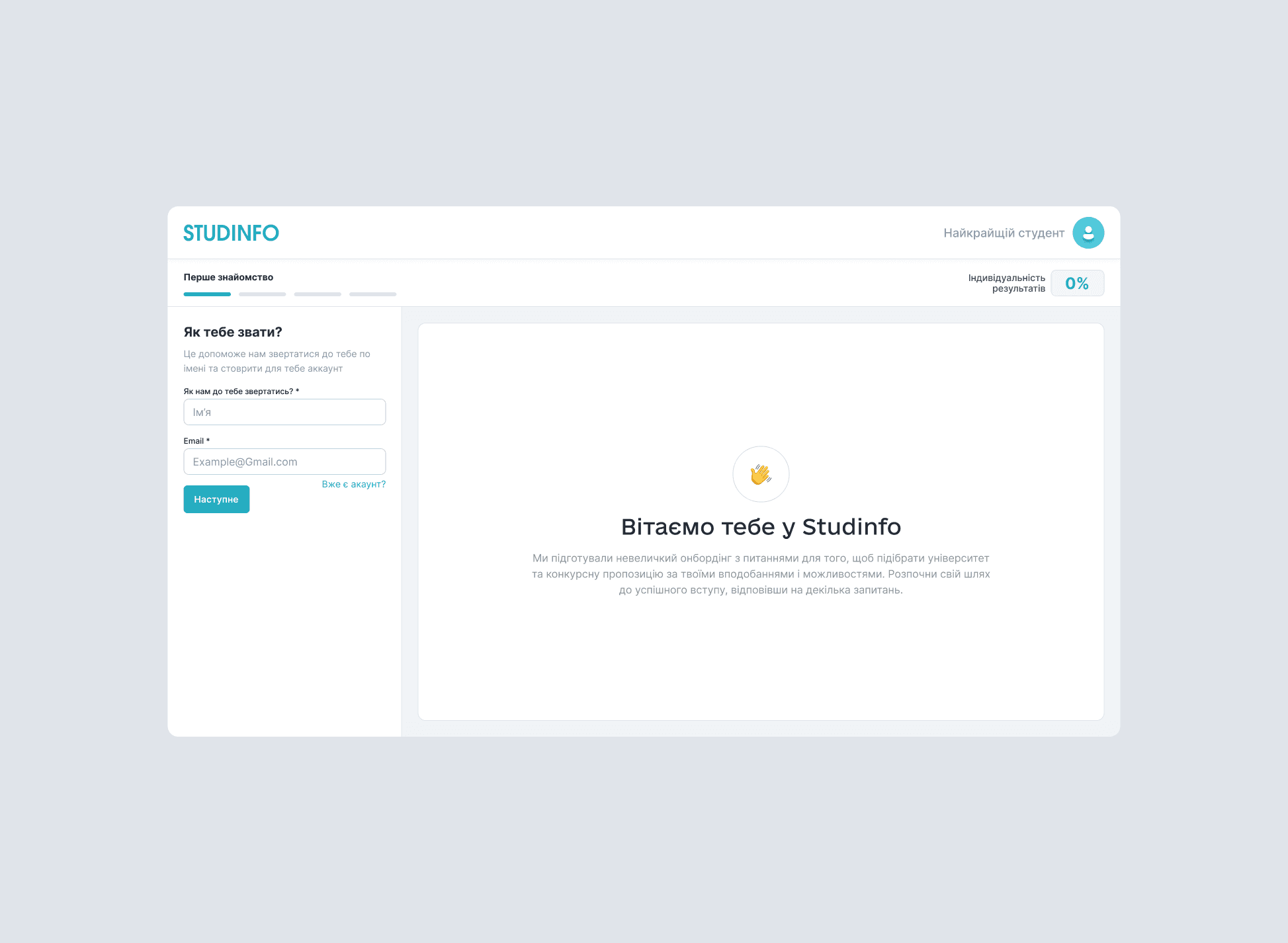
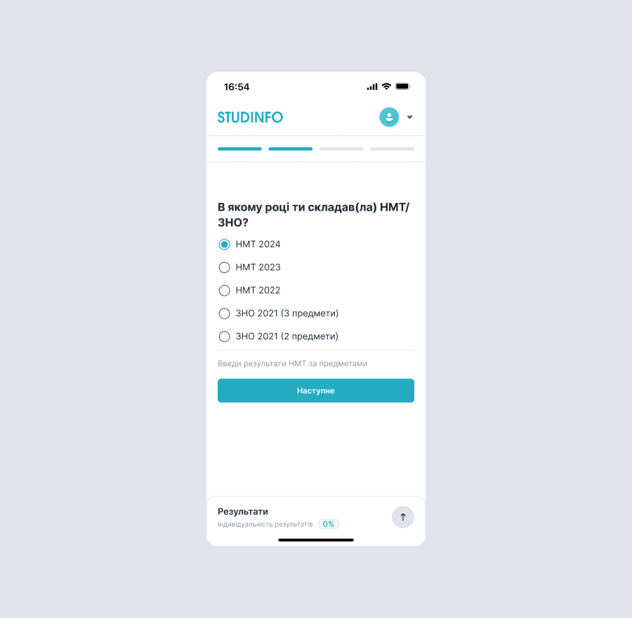
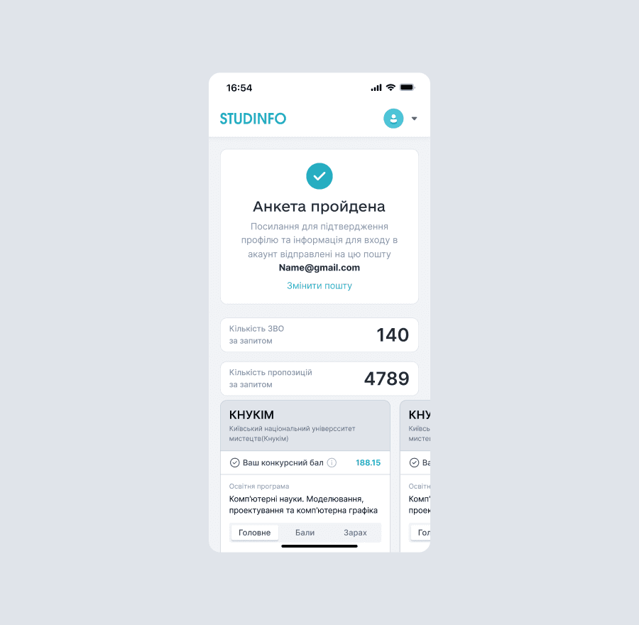
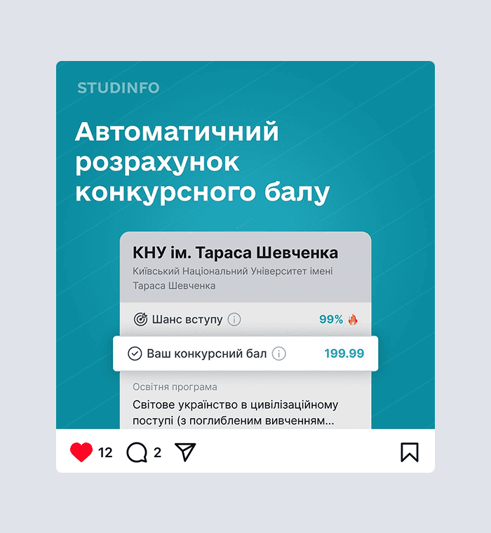
• Registration and onboarding, featuring a questionnaire where users enter their NMT results and interests, and instantly receive personalized suggestions.
• Saved profiles: users can store multiple input results and switch between different application strategies.
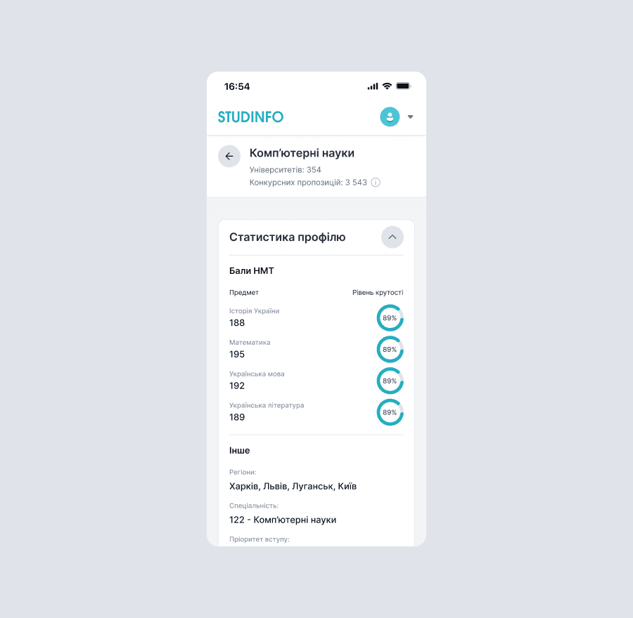
• Personalized profile page: a sidebar with profile information and a list of recommended academic programs.
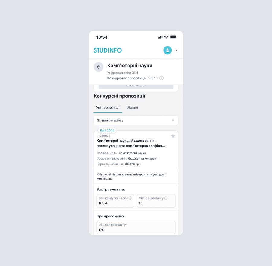
• Program detail page with key indicators (ranking, budget threshold, number of applicants).
• Profile settings page.
4. Evaluate Product
After launch, I initiated a round of usability testing, which included:
• Moderated testing sessions to observe how users interacted with the live product
• Behavioral analysis using Microsoft Clarity, helping us identify friction points and optimize key screens
Results
65%
User-reported recommendation rate
65%
User-reported recommendation rate
65%
User-reported recommendation rate
Conclusion
During the admission campaign, we carefully analyzed platform usage and reflected on previous challenges. One key insight was the importance of mobile convenience — which led us to fully adopt a mobile-first design approach.
With a deeper understanding of our users’ needs, we're now preparing new features to support applicants in the upcoming campaign. I’ve already designed some of them, but unfortunately, due to an NDA, I can't share them just yet 🙁
This year, I contributed by:
• Running a Kano analysis to prioritize upcoming features
• Conducting a Van Westendorp price sensitivity study to explore monetization opportunities
• Leading a new round of user interviews focused on this year’s applicant challenges
Tools
• Figma – Design
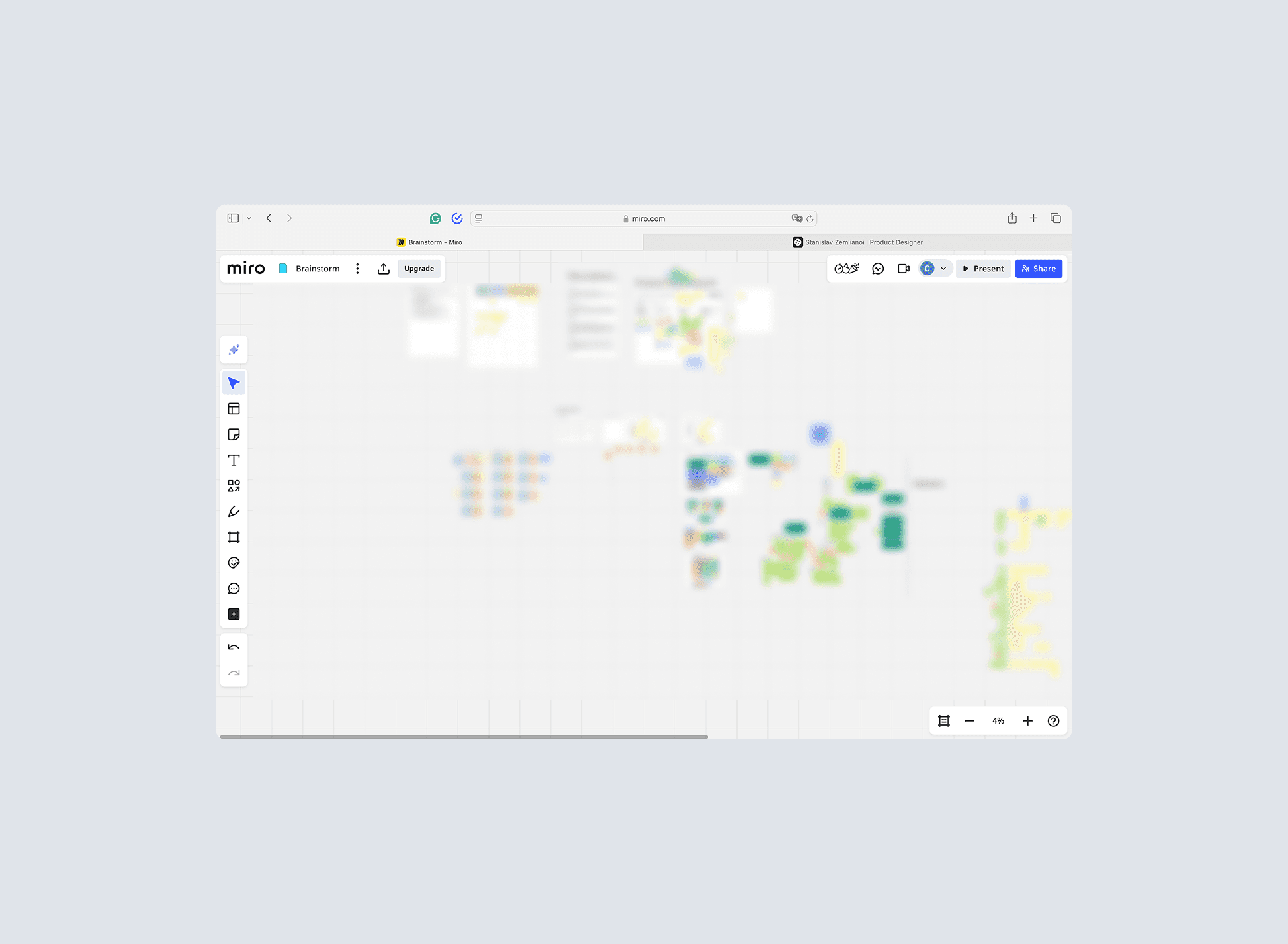
• Miro – Ideation and mapping
• Useberry – Card Sorting
• Google Forms - Surveys
• Microsoft Clarity – Behavioral analytics
Others
In addition to working on the product, I also designed assets for social media, pitch decks, and promotional materials.